Design System Core Infrastructure
Migrating enterprise primitives from fragmented legacy layers into a unified, high-velocity Tailwind token engine.
Role: Lead Product Designer (Systems Governance & DX)
Key Learnings
- You can't do it alone, advocate and make collaboration the focus
- Everyone tries to build the system themselves at least once
- Design concepts are the highest form of a design system
- Your system is as good as your worst critique
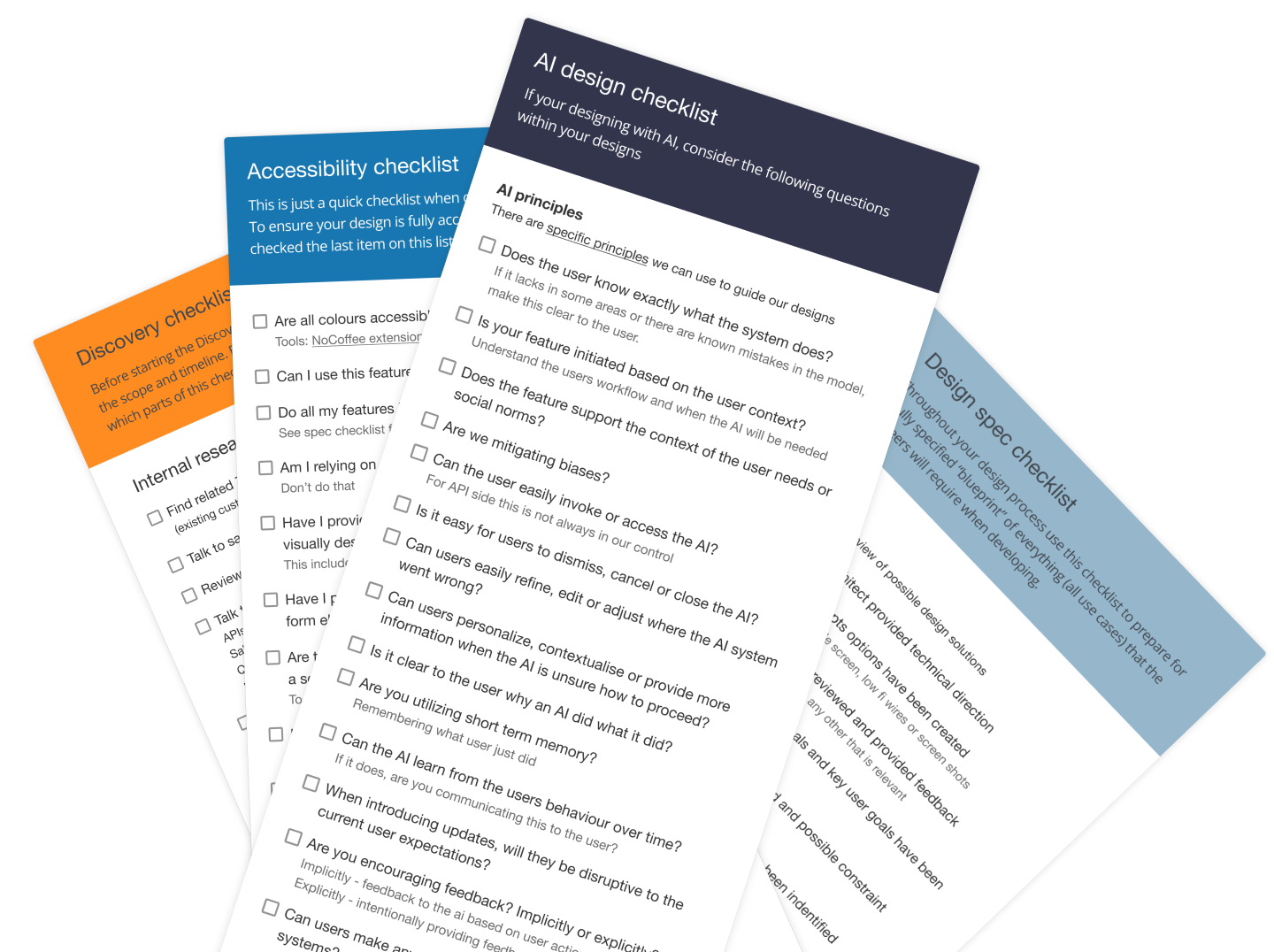
- Design guidelines and patterns is what will make working with AI much easier
- Governance and design drift needs to become the design teams priority
Real-World Technical Debt
Overcoming Architectural Fragmentation
As enterprise scale widened, our product suite suffered from profound UI fragmentation. Key user primitives were deeply tangled in aging, non-responsive React and Backbone legacy codebases. This created massive visual drift across product variants and spiked developer handoff friction. Engineers were forced to manually hunt for styles across disparate repositories, making consistent, accessible UI delivery nearly impossible at scale.
Enterprise design systems do not exist in a vacuum-sealed Figma file. The true challenge isn't just creating clean new styles, it is untangling multi-tenant layouts bound to rigid legacy configurations deeply embedded across ecosystems. I have been part of multiple company migrations that respect these production constraints and lead these initiatives.
![Contribution strategy diagram: 'All agile teams contribute' on the left, the @learnosity/LDS, @learnosity/LDS-macro, and @learnosity/LDS-[insert] component tiers in the middle, and LDS team, Design team, and Agile team approval steps on the right.](/images/design-system-strategy.png)
Structural Token Migration Strategy
Translating React Bootstrap to Tailwind Primitives
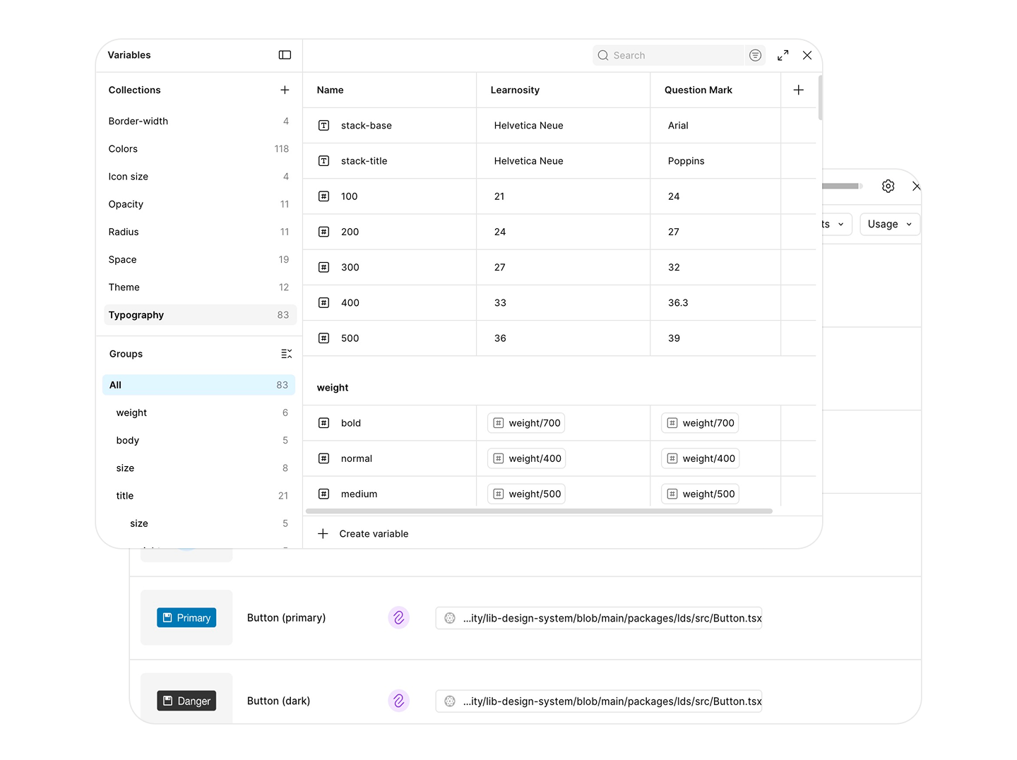
To resolve the structural drift, I am leading the comprehensive migration of our cross-product design primitives into an atomic Tailwind token framework. As a team we mapped out legacy Bootstrap layout parameters, button variants, and form states, translating them directly into modern, responsive multi-tier Tailwind tokens. This decoupled the core visual tokens from platform-specific code constraints, enforcing consistent styling across legacy React Bootstrap components and newer web frameworks simultaneously.
Code Connect & Figma MCP Automation
Direct Developer Environment Integration
- Implementing Figma Code Connect: Design specifications are only as good as their implementation fidelity. To bridge the gap between design files and the code repository, I am introducing Figma Code Connect. By linking live system components directly from our active repositories into the designer's workspace, developers can instantly pull accurate code snippets without manual parsing or styling translation guesswork.
- Automating via Figma Model Context Protocol (MCP): To scale token maintenance, we pioneered the use of Model Context Protocols (MCP) to bridge the gap between design environments and engineering builds. This infrastructure achieves automated, real-time token delivery and asset handovers, minimizing manual developer or designer synchronization steps.
System Governance & Active Coaching
Scaling Organizational Maturity Across Disparate Frameworks
Shipping infrastructure is only as effective as the governance models supporting it. Today, our product ecosystem operates across a dual-framework reality: maintaining high-stakes enterprise workflows deeply embedded in legacy React Bootstrap environments while simultaneously scaling net-new product features inside a modern, utility-first Tailwind token architecture. Managing this split requires continuous, high-level structural oversight across multiple codebases to prevent visual drift and system regression.
To scale contribution without introducing structural chaos, I work on continuous product team alignment models. Rather than acting as a strict system gatekeeper, I introduced a three tier contribution model — focus on unblocking product squads.
AI-Assisted Scaling & Hands-On Mentorship
Design operations require immense macro-level execution. I regularly leverage AI tools to accelerate my own contribution efforts. I translate these operational efficiencies into active team scaling, spending my time mentoring and coaching product team members through advanced layout logic, end-to-end UX strategies, and rigorous semantic accessibility standards.